Design systems for youth travel brands and trying to iterate cool at scale.
Student travel is a money-making beast. It’s a billion dollar market with a guaranteed influx of new users every year. But because every year this new influx of thousands of students hits campus with zero previous experience of what it is to ‘Spring Break’, student travel providers have a huge amount of brand narrative to push, at scale in a very short time-to-buy cycle. Much of that cycle is done through influencer networks and co-dependent relationships with campuses, and those networks and relationships are very precarious.
At Pollen one of my side quests was overseeing several M&A’s that were happening in the US and Canada. All of them were youth based travel companies, and all of them had significant cultural traction in their respective markets. A big part of this process was embedding with these student teams in Las Vegas, Los Angeles and Toronto, and trying to understand what sells the Spring Break dream. It’s incredibly nuanced work because it pivots very keenly on ‘accessible mainstream cool’ which is something I spent a lot of my time at MTV (and in Publishing generally) trying to architect around. In many ways, Spring Break is like working at the VMAs - it’s annual, it’s visceral and the feedback loop is very very short. If you aim wrong it can have significant immediate fallout on revenues. Pivoting and redefining cool is not that scaleable - what is scaleable is iterating from a honest narrative place, adding as you go, building a safety net, building trust and a reputation. Cool on top of that is the special sauce.
One issue with Spring Break is - it looks cheap and it looks precarious. It has a reputation. So to win Spring Break as a market you have to approach it like a festival. It’s a massively experiential thing, and if you’re able to capture that experience, communicate it, and be very clear that your headliners are bigger than anyone else’s, then in turn you get the largest traction. Large traction in 2019 means exponential traction in 2020 - it snowballs, particularly when the prior attendees resell through influencer networks the following year.
How the market works.
The student travel market primarily markets through college campuses in the Fall, with specific aim at the incoming Freshman market. Within the Freshman market are Greek societies which run their own internal dynamic. Spring Break is one specific high value event, but other events such as Winter Ski and Sports Trips make up the extended offering. Typically a Campus - or specifically a Sorority or Fraternity within a campus - will align with one destination and one travel provider indefinitely based on referral perks. The sales market is very territorial, and a lot of effort is made upfront to ‘close’ a campus - the reason for this being that for every year group that attends an event, the following incoming Freshman year is influenced by the previous year, generating considerable ARR which in turn allows for investment outlay.
Spring Break is typically the biggest spend for both the student and the organizer annually. Students typically spend between $800 domestic and $3000 international for a one week event. The average campus year group or Sorority might enlist 50-100 students per year. If the Spring Break works, that year groups sports team will be open to pitch. And so on.
Who pays for this? The parents. So while the primary driver is attracting the students to the event, there has to be clear Trust, Transparency and Value For Money signals aimed at the financial provider. This extends to insurance, guarantees, medical and ‘educational’ elements (the parents like to sense that their kids will at least visit an Aztec temple and see some culture).
With this in mind, the organizational branding has to be trust driven, but the student communication has to over-hype the annual lineup. It has to forever be better than last year. It has to be bigger and better. It has to be unmissable. And we can 100% blame MTV for this, but the social network enabled hype-cycle is very real. It is a lot like large mainstream festival marketing - it’s about driving the forward narrative while underlying trust markers to investors.
Why scale?
Normally with singular events such as festivals, beyond the marquee branding and narrative you’re really building up to a one off execution followed by a 6 month cool-down. But with Student Travel the turnaround each year is immediately cyclical. As one event ends, the student returns home to the next event pitch. And this pitch is not always from a professional - it’s often from an influencer or representative and the assets are often printed locally.
With this specific Spring Break cohort, we were dealing with 55 schools each with Freshman, Society, Sports and other groups attending. We were covering 12 international and domestic travel locations, each of which required on-site merchandise, visuals, staging and signage. At the marquee level, we needed to maintain multiple social channels with variable assets, UGC, above and below the line and full destination campaigns. A quick calculation placed the visual assets at over 200 just for below the line use, including 12 variants per destination and 55 school specific variants. Because of the campaign values, this involved a large amount of SEO and tracking, which added additional requirements for A/B testing and copy changes.
So this clearly required a systematic approach at scale given my team was at the time 6 strong with only 2 of them Marketing orientated. I had to hire quickly, but the lead time and ramp up was too short, even for freelance. For the first Spring Break I’d be directing it alone and I had under 8 weeks to execute.
Make it adaptable.
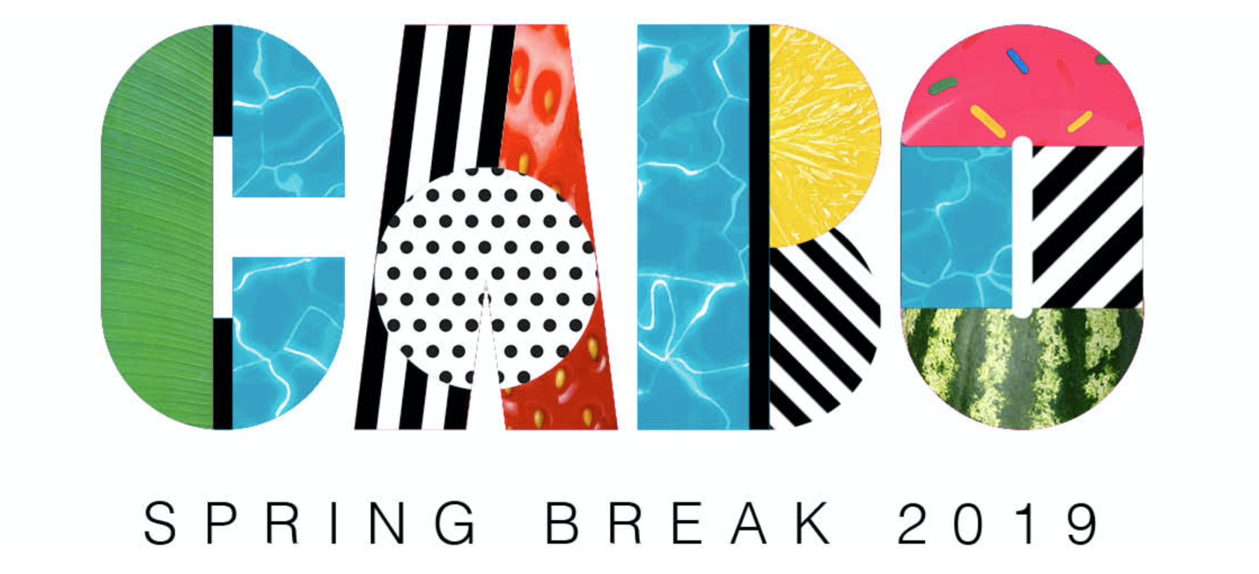
Our designs were rating well in user testing at this early stage, however our stakeholders wanted more options relating to ‘premium destination’ - with more a focus on the destination itself aimed at closing hotel deals. We began by breaking down the framework approach to its components and simplifying our approach. Could we make an impact with UGC and without UGC? Could we keep stock elements as destination-specific triggers? How could we make this feel more tropical and more luxurious?
We began using less vector and more photography in our foundation to ‘luxe up’ the destination IDs, and we found that in doing so we validated our framework further through it’s flexibility. We also retroactively applied our tonal changes to our existing designation designs. We still kept the UGC focus, but we offset it with more detailed execution, and developed a pictorial destination ID and a ‘lockup’ that operated better on social video stories and web page headers.
Make it scale.
One of the limitations we discovered with our UGC framework style however was how it worked with artist imagery. During our discovery of the campaign we began to look more closely at the experiential execution and the events we’d be coordinating at the tail end of the campaign when in-destination. With that came headliners for events, and with that came artists bookers and agents. We began to adopt the framework for a more typographic led approach to allow for studio quality imagery which had IP limitations attached to them, such as crop, orientation and scale. Bookers want to see their artists, and some artists have very specific IP guidelines related to their image. While the framework was polling well with the customer base, it was polling less well with Artist Management and we had to decide if chasing the artist was more important than campus virality.
This was not unexpected - I had dealt with Agent and Artist IP restrictions extensively in Publishing and Broadcasting. Agent and Artist interactions are very relationship driven, and typically the focus is on unified promotion (in my experience). I, as a Creative Director am defending my brand space, you as an Artist or Agent is defending your IP - we collectively find a mutually beneficial space or boundary within which we can generate concepts that do not cross either defensive line. Student Travel is different. The Artist is there for the event money, yes, but they’re there for the network effect within that demographic. They are not there, primarily, for that event to garnish them with cultural cache. Most major artists do not, in reality, want to be associated with Student Travel. This was a miscalculation on my part. But like most things in Artist IP, the miscalculation is largely vibes based. They want to see the final execution before they agree to it.
UCG at this point started to become less a useful grounding device or reality marker and more a liability - so it had to go. We had to move upmarket quickly and begin a much larger Artist-to-Artist negotiation than I’d first imagined. This meant that our framework needed to move to a form which was very iterative and simple, that could work more keenly with other brands - as a good example of this, Bumble began an early partnership with us for the incoming Spring Break cohort aimed at Women and Women’s Wellness on-resort. Energy drink companies were now interested in co-sponsoring some events. So now we had to consider a much wider gamut - Wellness, Artists, Tech Companies, Retail - alongside actually making it aspirational for the students who were attending.
Make it commercially viable.
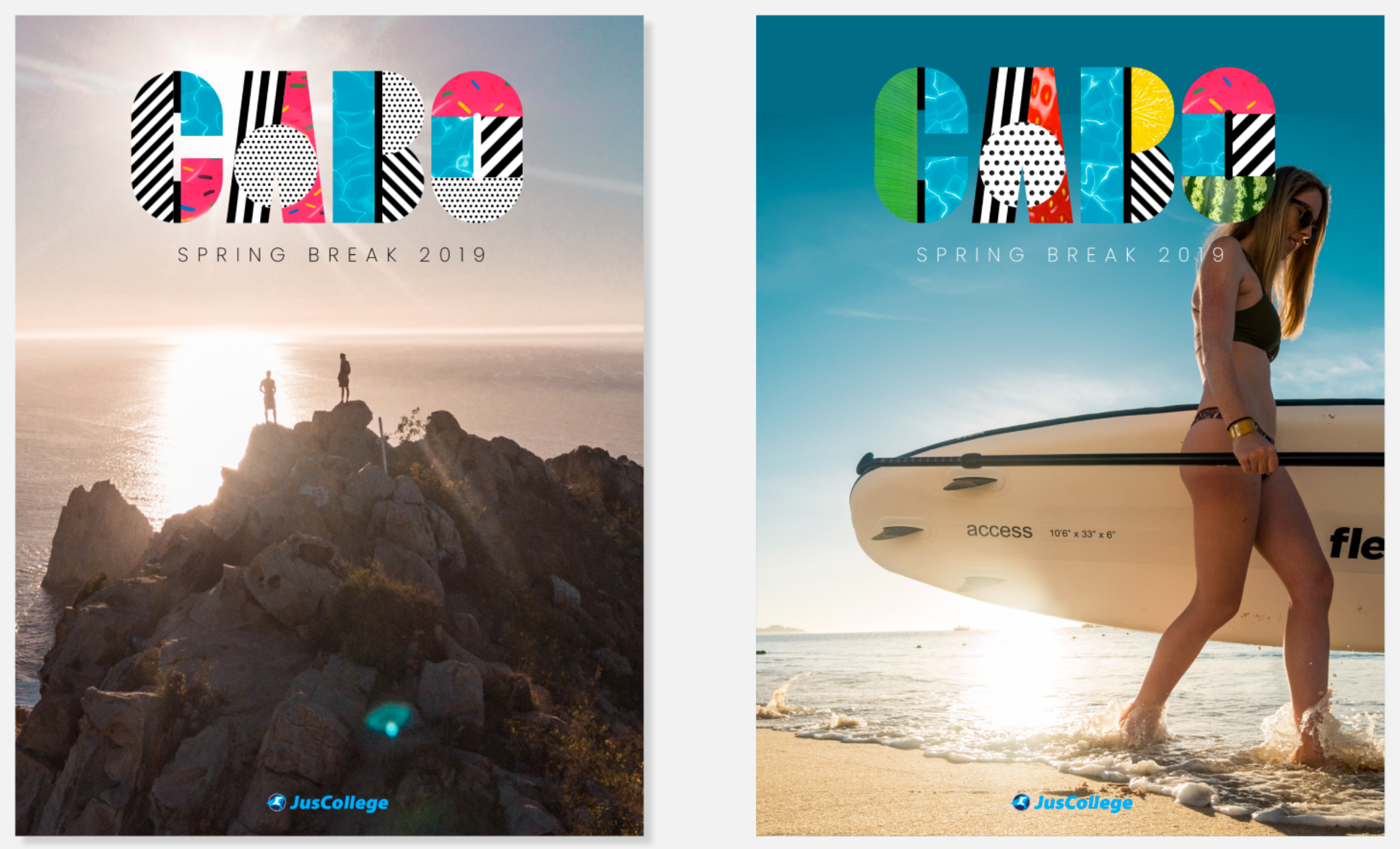
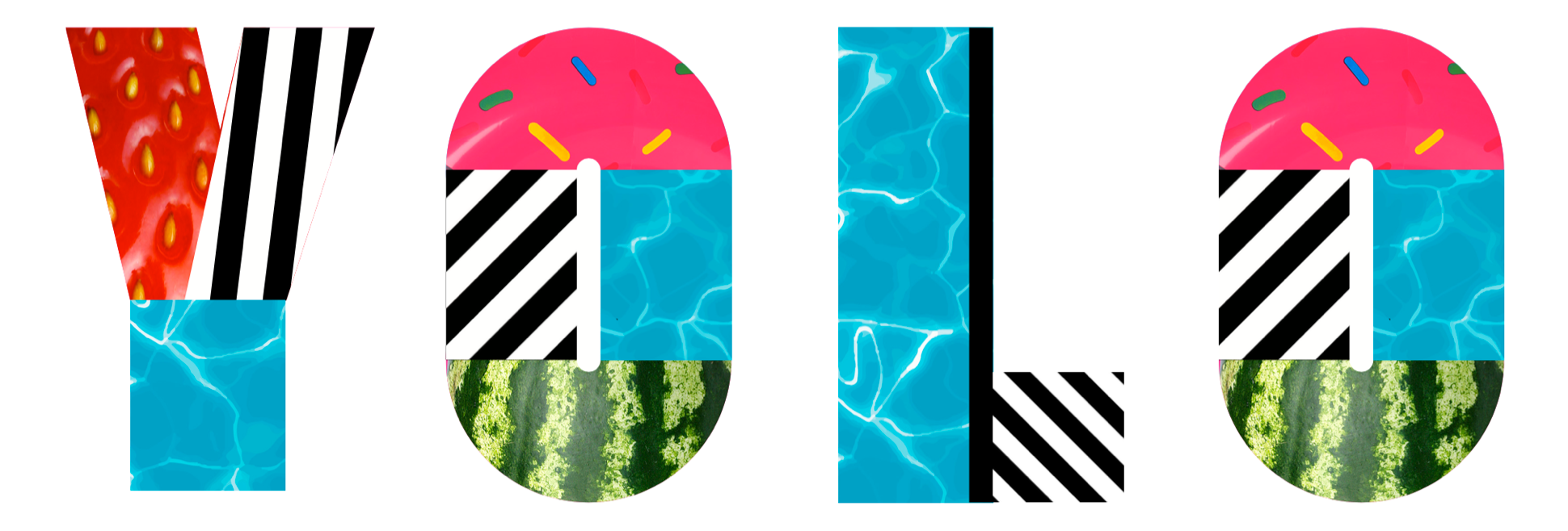
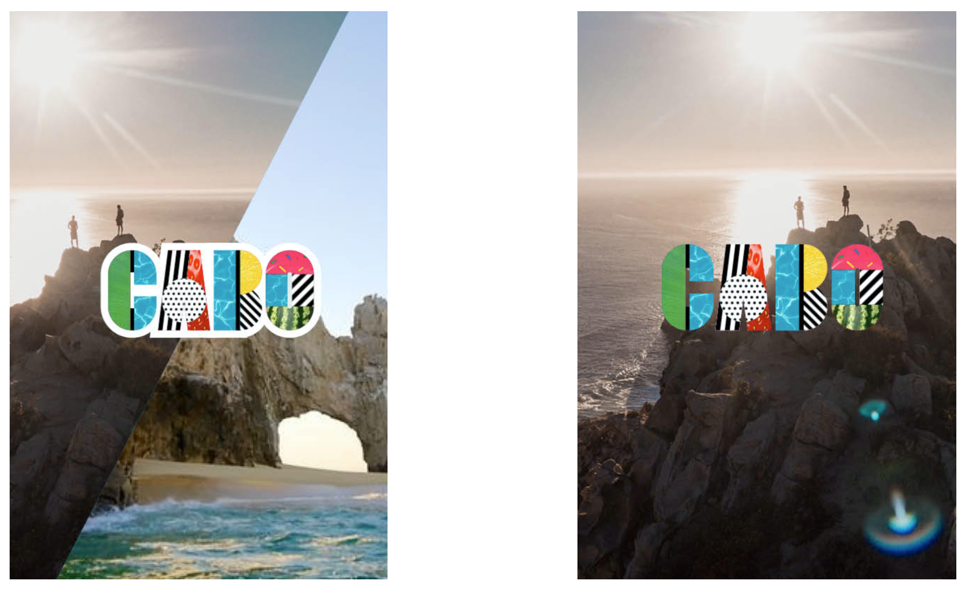
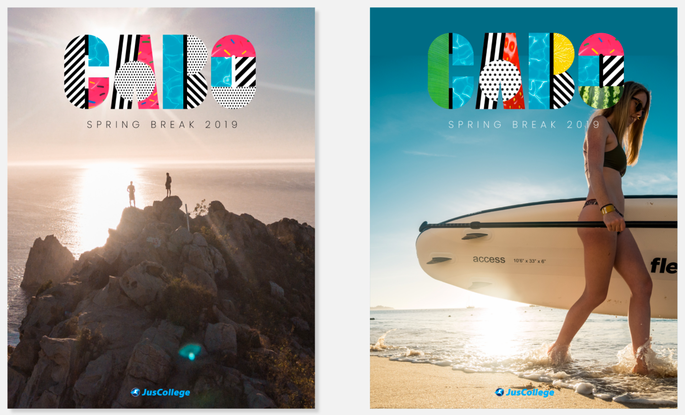
We took many of the elements and devices of the montage framework and applied them to block type treatments. This allowed us to - in a single type treatment - encapsulate a destination in a locked self-contained logo style, which made its application more scaleable across static and video backgrounds, and gave us clear options for animation.
We also began to play with other messaging, adopting the framework within other typography to experiment with storytelling, along with using it in the context of broader storytelling imagery.
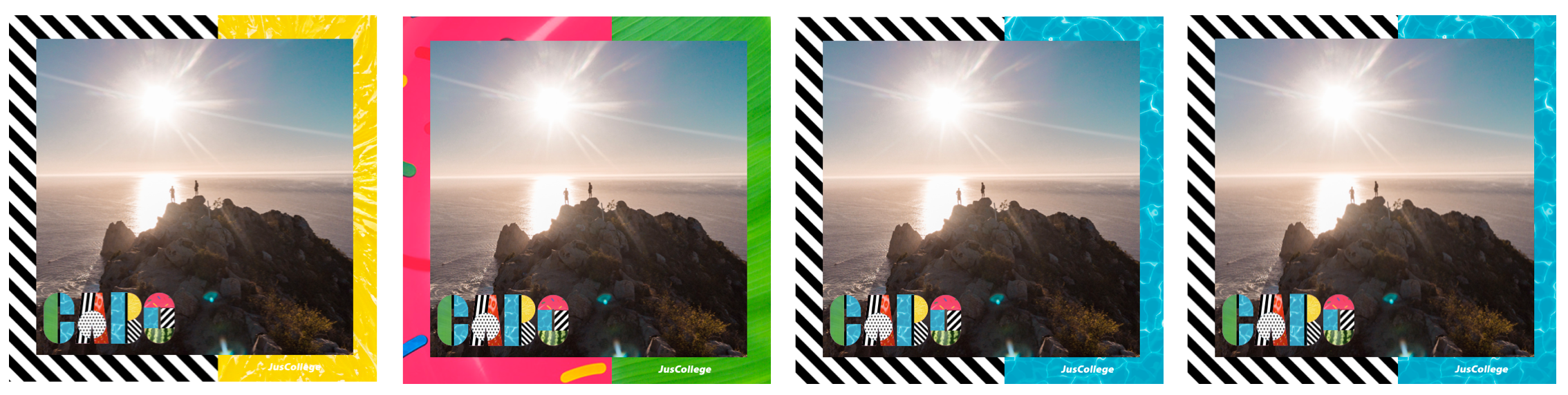
Using a self-contained type-based framework allowed us to use more large scale imagery, and incorporate UGC as part of that on social with framing devices. The frames allowed us to take devices and use them to provide contextual impact while not interrupting the core imagery.
Most of our communication strategy was aligned to Instagram, and as such we had to operate between 1:1 and 9:16 formats, while also making sure that artist imagery remained un-cropped and untouched.


Outcomes.
The type block treatment managed to thread the line between artist IP and fun. It was malleable enough to handle stage graphics, merchandise, hotel signage, animation and social. It also contained enough foundational logic to handle to move from sun to snow, from beach to sports field. It handled specific campus and greek logos and colour ways and became infinitely flexible. In terms of type treatments, this was one of the more effective I’ve leveraged and it lent itself very well to mass-personalization and brand-blend while still keeping a strong, individual typographic identity.
Early exploration.
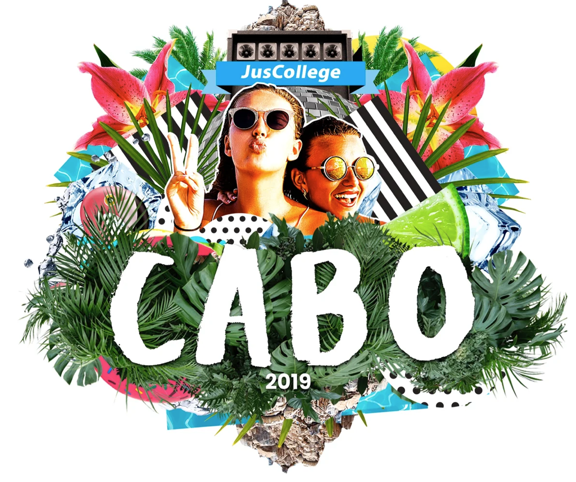
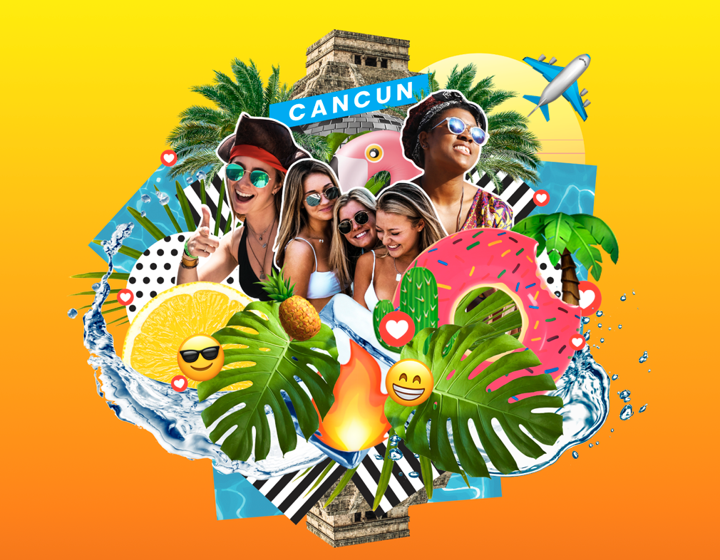
To scale the design with the amount of variants in the brief I immediately moved away from bespoke illustration or specific key photography and began to look at montage styles and design frameworks based around core patterns, rhythms and devices. One clear device was gradients - they were flexible, allowed us to chose complimentary colour-ways per destination, would scale to partnerships and brand guidelines, and could be used across multiple brand touch points from web product to merchandise. Another clear device was emojis. Emojis allowed us to quickly add mood or a sense of social to the campaign. The reason this was strategically important was that with a new influx of students every year, and the average college student last only four years in their degree, the ability for us to re-use photography from the student trips wasn’t a long-game solution. Sure when you’re 22 us using you in a poster campaign is cute - you and your friends, drunk, enjoying the sun. It’s a slightly different story when you’re 25 and trying to lock down that finance job. This meant we were largely reliant on UGC and social imagery to fuel our content pipelines, and with that comes lower quality, shaky footage and ‘embellishment’. You can deny that reality by heavily polishing your content or having a high refusal rate - or you can lean into it and make your professional content look as accessible and as fun as the UGC. We chose the latter. By combining UGC with stock imagery you achieve an unusual look - neither appears what it was in reality. The UGC looks punchy. The stock imagery looks relevant. It also most importantly looks truthful.
Another range of devices we utilised was a mixture of in-destination specific stock imagery (locations, buildings, mountains), in-country specific stock and vector imagery (flowers, tropical fruit, palm trees) and experientially specific imagery (pool floats, surfboards, boats, fruit). There’s a few reasons for these using devices which are beyond general aesthetic. We used experiential imagery to ‘shortcut’ the destination - what you see is what you get - if there’s a boat, there’s a boat party, if there’s water there’s a beach, if there’s a pool float there’s a pool. But we also used this imagery to bypass restrictions - the boat party supplier wasn't confirmed, so a cartoon boat fills in, you can’t advertise alcohol to under 21s in the US, but in Mexico you can drink it and it’s part of your holiday package - so we show cocktail fruit, ice cubes and bubbles.
We also introduced patterns into the designs, although they play a largely supporting role - this is a ‘unknown unknown’ scaling element. Do we need staging backdrops? What colour are the tote bags? These patterns were our backup if all else failed. A consistency in the framework foundation - spots, stripes, circles, squares - a bread and butter element that we treated like a Swiss Army knife in case the on-site experiential got tricky.